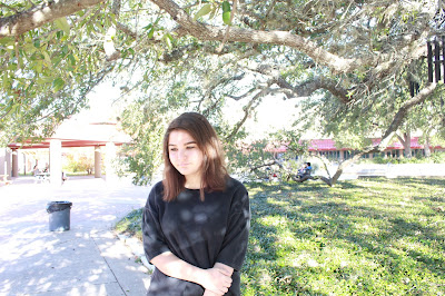
- the models lips and eyes were made larger, her eyes were brought down and her neck was made longer and slimmer.
- the model was made skinnier in the stomach, her shoulders were brought up, her legs and neck were made longer and slimmer and her entire body was lightened.
- the model was made a lot slimmer, her boobs and butt were drastically edited, her hair was made longer and the editor lightened her complexion.
- i don't think its ethically acceptable to edit someones body because it creates unrealistic standards and can potentially hurt the person and anyone who views the photo because these glorified features are naturally unattainable.
- if the person/model didn't consent to the photo being edited or it is more edited than agreed then its more unethical.
- no change is ok because its mocking the models actual beauty by creating something not naturally achievable like bigger eyes or a different body type (bone structure being slimmer etc.).
- fashion photography has no rules against photo manipulation which makes it less truthful and ethical than photojournalism, which has standards for how much can be manipulated.
- photojournalism is closer to reality, which makes it more ethical to fashion photography where there seems to be no sense of reality because there really is no limitation on what can be manipulated.
- you showed us these three videos to illustrate what actually is possible with photoshop and what actually happens in the fashion photography world.
- we're still in a patriarchal society where women have to have a perfect body and face to be worth anything, women are held to a different standard in appearance in which it isnt deemed acceptable to weigh a little more, or have a few extra curves which is extremely wrong because we are people too, no one is perfect and its honestly disgusting that photoshop to this extent is allowed.
Friday, December 11, 2015
fashion photography
Wednesday, December 9, 2015
Monday, December 7, 2015
magazines part 2
- early covers- the first magazine covers were modeled after books in the mid 1700s and only showed a title and publication info. slowly pictures began to be added and the first cover lines weren't added till the late 1800s.
- poster cover- magazines became larger to highlight the cover art that most if not all magazines started to have. professional illustrators made their mark and became large for the work they did.
- pictures married to type- cover pictures began to be surrounded by text giving insight to the magazine in a way that was aesthetically pleasing and did not cover up the subject. different fonts and colors were utilized to compliment the picture.
- in the forest of words- pictures then became second to bold cover lines and designers then began to have the words compete with the picture. magazine covers would be completely covered in text.
my favorite cover
New York, February 17–24, Spring Fashion
"In a stunning cover for New York’s “Spring Fashion” issue, Erik Madigan Heck created a wall-to-wall effect with the red and white floral pattern on Lupita Nyong’o’s Stella McCartney dress and a coordinated background. Nyong’o is no wallflower, seeming to pop right out of this inventive and stylish cover."
I like how Nyong'o's dress matches the background, it allows her to stand out. The use of makeup with similar tones gives it some balance but also draws the viewers eye towards her face. The lighting in the picture illuminates Nyong'o, making her stand out while looking gorgeous. However, she looks lighter than she actually is, which kind of upsets me because the cover is trying to appeal to European beauty standards, when she, in her natural state, is well beyond those standards.
Thursday, December 3, 2015
best covers
news and politics
- The Advocate, formal
- Wired, formal
- ESPN, informal
- OUT, environmental/ formal
- Harper's Bazaar, formal
- ESPN, informal
- New York, formal
- The Atlantic, informal
- FamilyFun, environmental
- The New York Times Magazine, formal
- Harper's Bazaar, informal
- Vanity Fair, formal
- Variety, informal
- New York, informal
- Men's Health, formal
- Bloomberg Buisnessweek, formal
- Golf Digest, informal
- Kinfolk, informal
magazine tips
- emotional appeal in the picture
- interesting and logically stimulating
- efficient, little text on cover
- familiar feel, issue to issue, font and color etc.
- able to create curiosity to draw the reader into reading the entire magazine
Tuesday, December 1, 2015
Subscribe to:
Comments (Atom)


